Changing A Brand Image
Dafmark is a Dance Theatre in Erie, PA. They were in search of a new logo due to a transition to a parent company, with 3 branches. Working with them for an entire semester, as a class we meticulously went through the process of developing a brand. We worked with Dafmark to create new statements for their Value Proposition, Positioning, Mission, Vision, and Values, a logo that works within a brand architecture, mock-ups for their website, mock-ups for a glass door decal, and a Brand Guidelines Document. Of 8 designs mine made it to the final 3.
The Essence of Dafmark
This began with an interview that we conducted as a class. During this interview, we asked questions that helped the founders of Dafmark relay their core values, the specifics of what each segment of their company does, who they are partnered with, and what inspires them. An additional technique we used during this interview, was a picture activity. As a class we compiled a bunch of stock images, some we thought represented Dafmark, and some we thought did not. Then we placed them randomly on a table and asked them to pick out images they felt were representative of Dafmark. These images ranged from certain dances, to abstract images of just color or shapes, to pictures of people expressing joy or intrigue. Using the information we gathered from this interview, we then created new statements for their Value Proposition, Positioning, Mission, Vision and Values. Upon completing this, we held another interview, where we presented these statements, and inspiration for the direction that we wanted to take there brand in. Ultimately, we landed on a Brand Architecture involving a primary logo for their company, and three secondary logos, one for each secondary offering.
Sketching
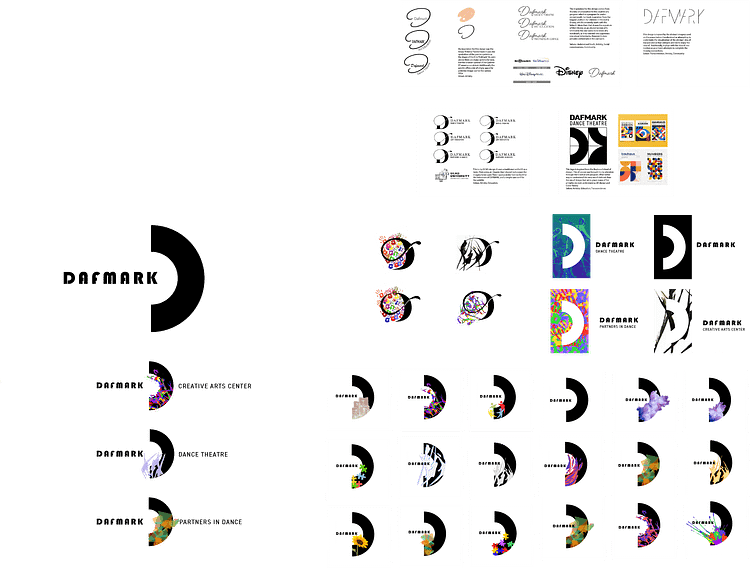
Upon completing the “essence of Dafmark” I then started sketching. This image shown below, shows the progression that the sketches took. First I showed some basic designs as well as the inspirations for them. Next I began expanding on a few of those designs, before settling on one that I felt matched their essence more than anything else. Upon finding that shape for the D I then began compiling different designs for the different pieces of the Brand Architecture.

Dafmark: Brand Architecture
Finally, I took the best of the designs and applied them to the Brand Architecture. For the Creative Arts Center I used a paint splatter that followed the shape of the D. For the Dance Theatre I used abstract shapes that represented the abstract motions of dance. I used purple to emphasize the idea of transcendence that was important to the founders. And Finally for Partners in Dance I used an abstract shape that broke the form of the D differently than the other shapes. This represented the members of Partners in Dance being able to break out of their normal activities.
 Mockups
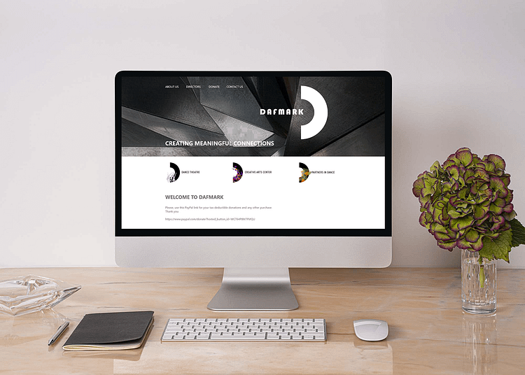
With the logos complete, we moved on to presenting them professionally. This involved creating presentations that matched the aesthetic of our Logo. Included in the presentation were Mockups for their website that showed the new logo in use, as well as mockups for a glass door decal. Additionally, we created a brand guidelines packet that specified how each logo was meant to be used, and the specifications for using it. This included negative space, allowed backgrounds, allowed colors, and proper usage of fonts.
 Mockups


0 Comments